The Problem:
There are many websites which sells fake or non-branded apparels. As Kapsons is already a famous brand in North India, the company wanted to capture customers from all over India. In order to achieve that look professional for the people to form their trust and be able to shop conveniently
The Solution:
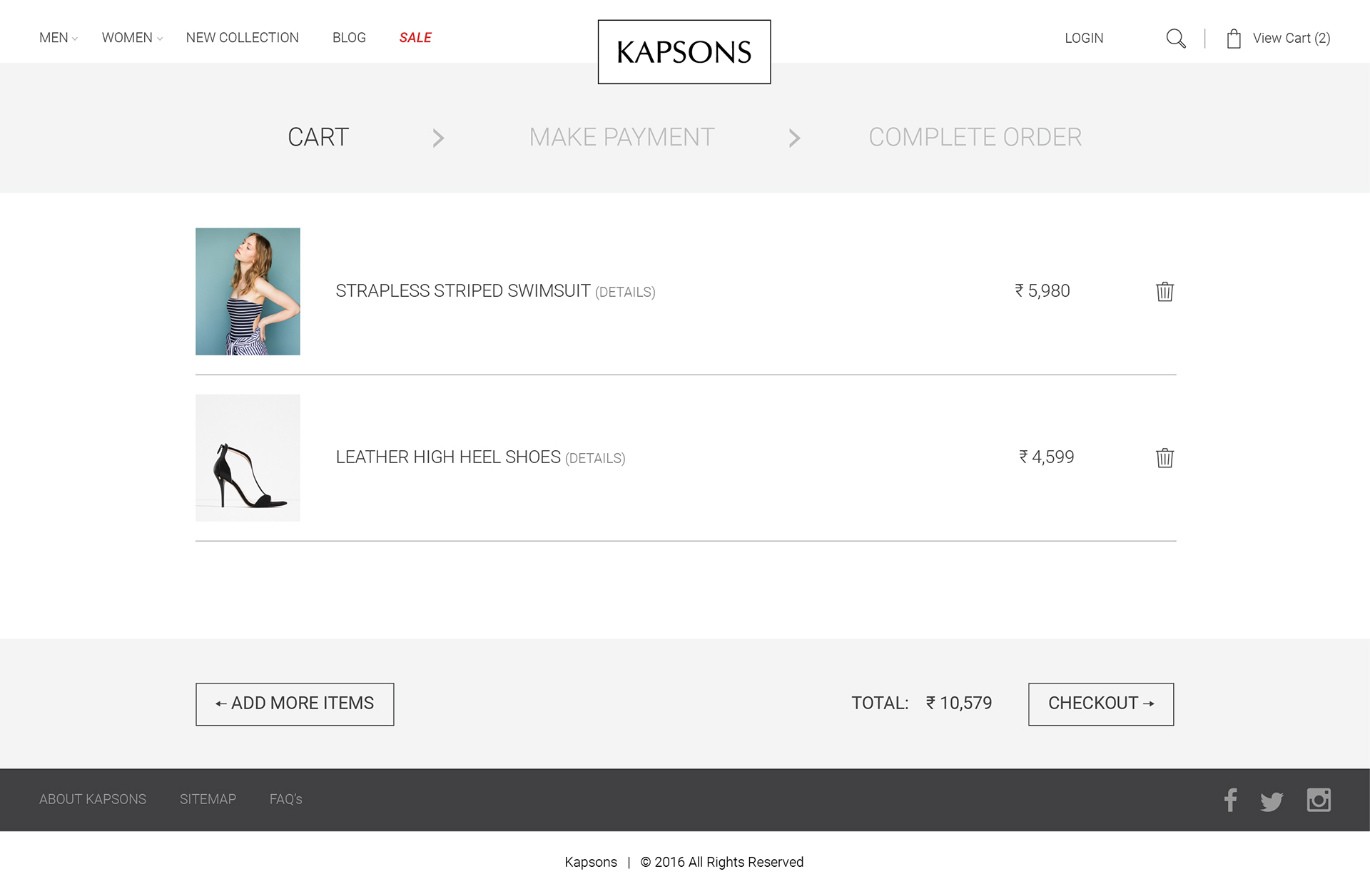
To design and create a fully responsive website for Kapsons where customers can experience shopping on any device of their choice. We aimed at making several filters so as to help them choose the right product.
The Research:
Kapsons is a leading name in North India for buying fashion apparel with a host of many high-end brands readily available at their stores, a design that is elegant and premium looking. In a meeting with the management of the company, it was clear that they wanted the website to be able to encourage new user registrations, thus increasing their database and retargeting them through online ads, hence increase in sales. To gain customer trust and make them believe that all products are authentic.
These Findings Led us to Research:
- Proper UX strategies to encourage for completion.
- Major existing players in the market
- To know the behaviour of the user while shopping online.
Learning:
We facilitated one-on-one interviews with Kapsons customers who regularly shop from their store, observing what they look for while shopping in-store or online.
- What are the specifications they look for while shopping?
- What makes them trust a brand online?
- What brands they would prefer while shopping online?
- How much money they are willing to spend online in comparison to shopping in store.
We found from my interviews that users usually look for brands, sizes, latest trends and ongoing offers. The look and feel of the website makes them trust the brand and that they are willing to spend the same amount of money while shopping online.
Define Requirements:
After sharing information with the management and asking them what a successful product would look like for them, I started working on the wireframes and to ensure that we are on the same track.
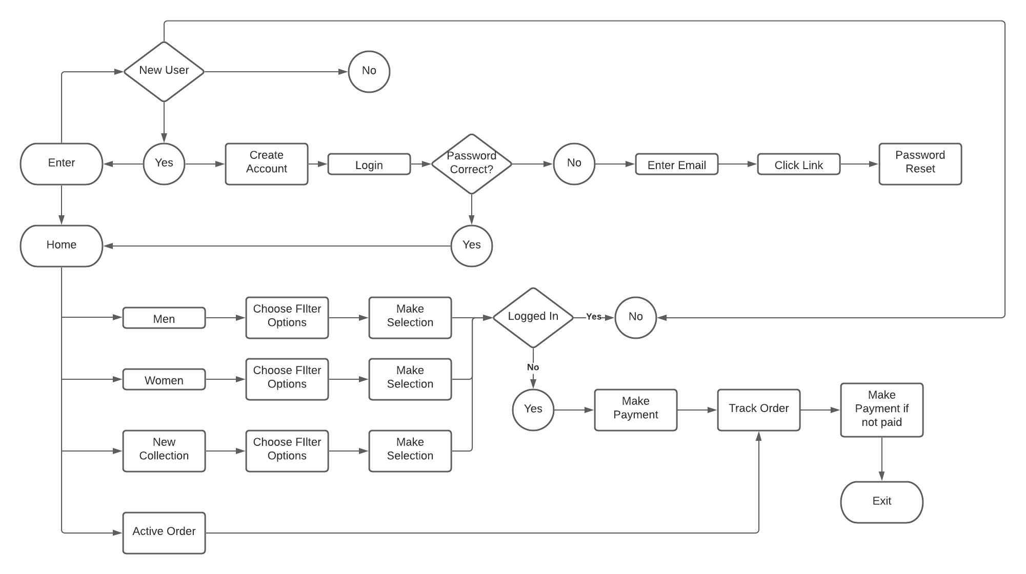
User Flow:
We created a flow using Lucid to illustrate how the user will navigate through the website.
Creating Drafts (Wireframes):
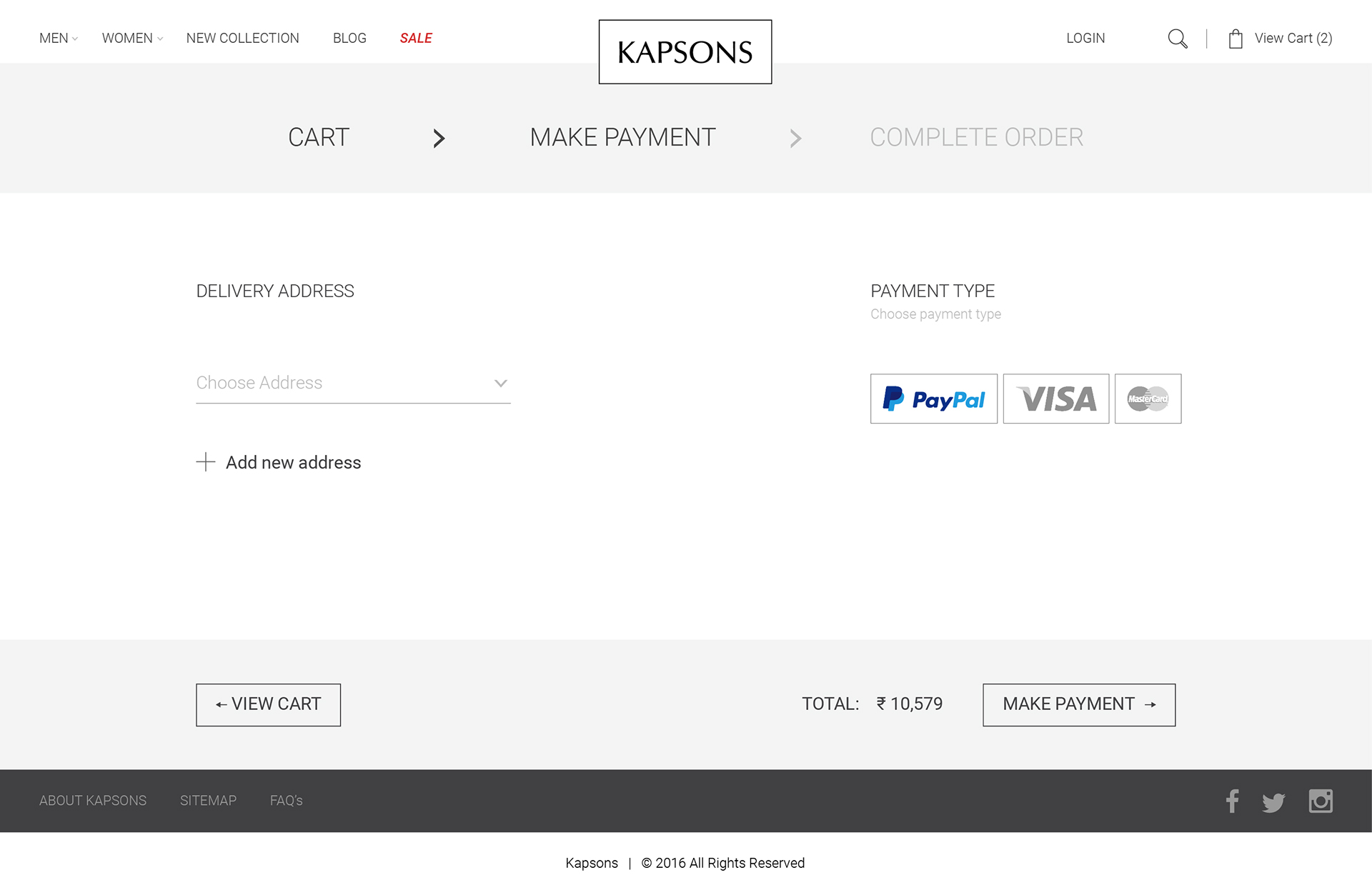
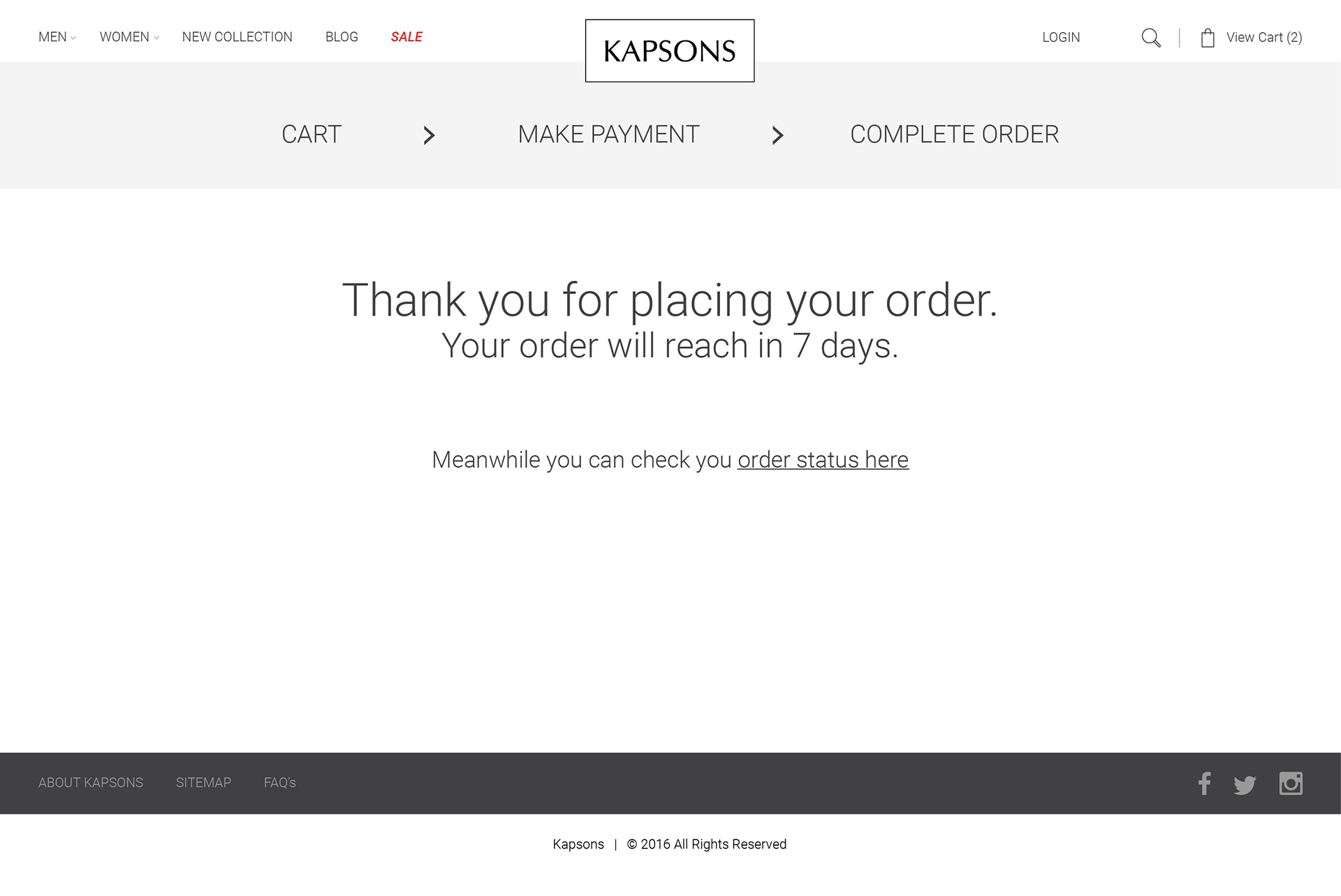
We started creating wireframes of each screen from home-page of the website to the payment gateway. I had to make sure that the user journey from finding a product, to making the payment online and getting the product delivered should be seamless and user friendly.
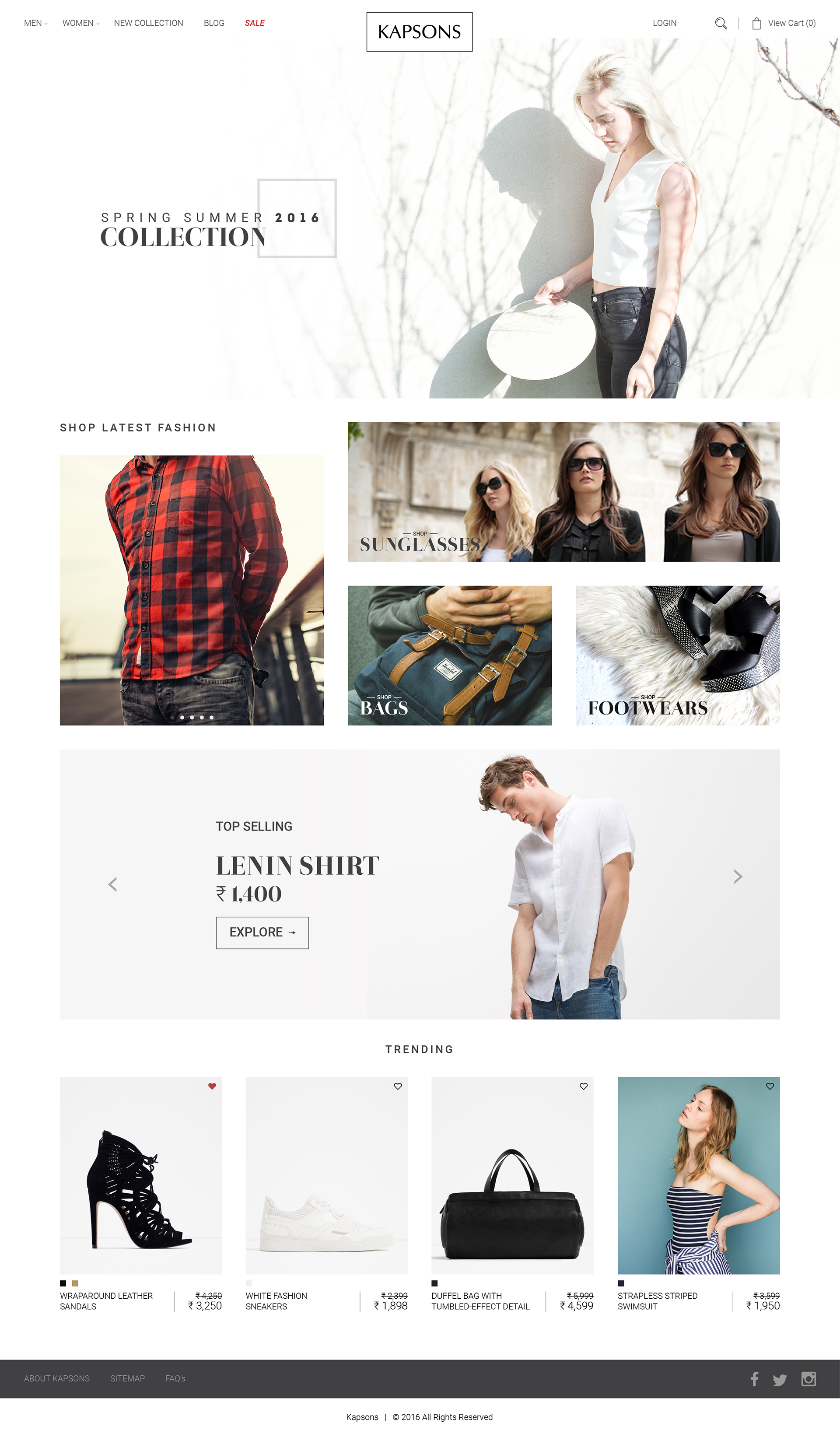
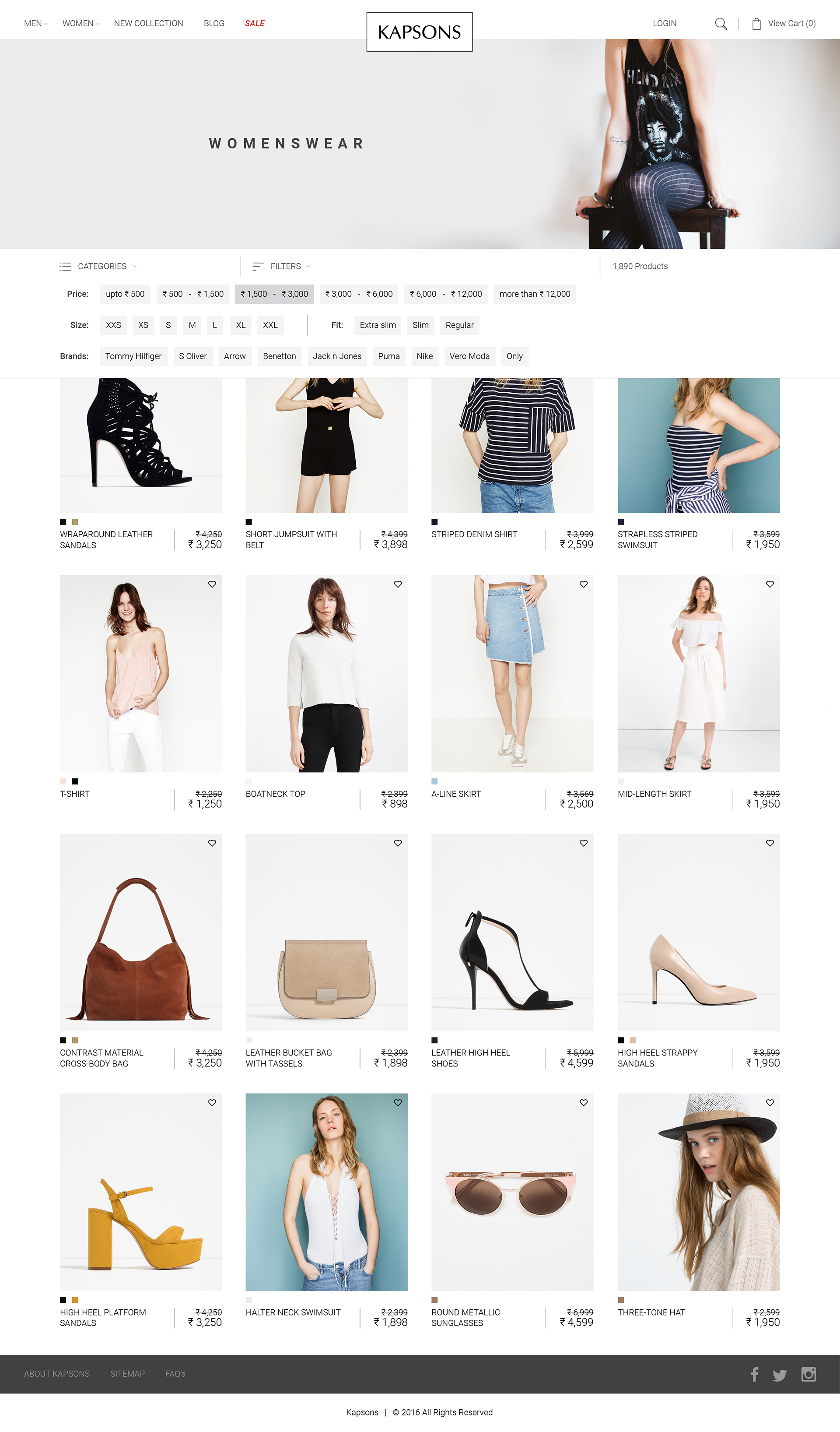
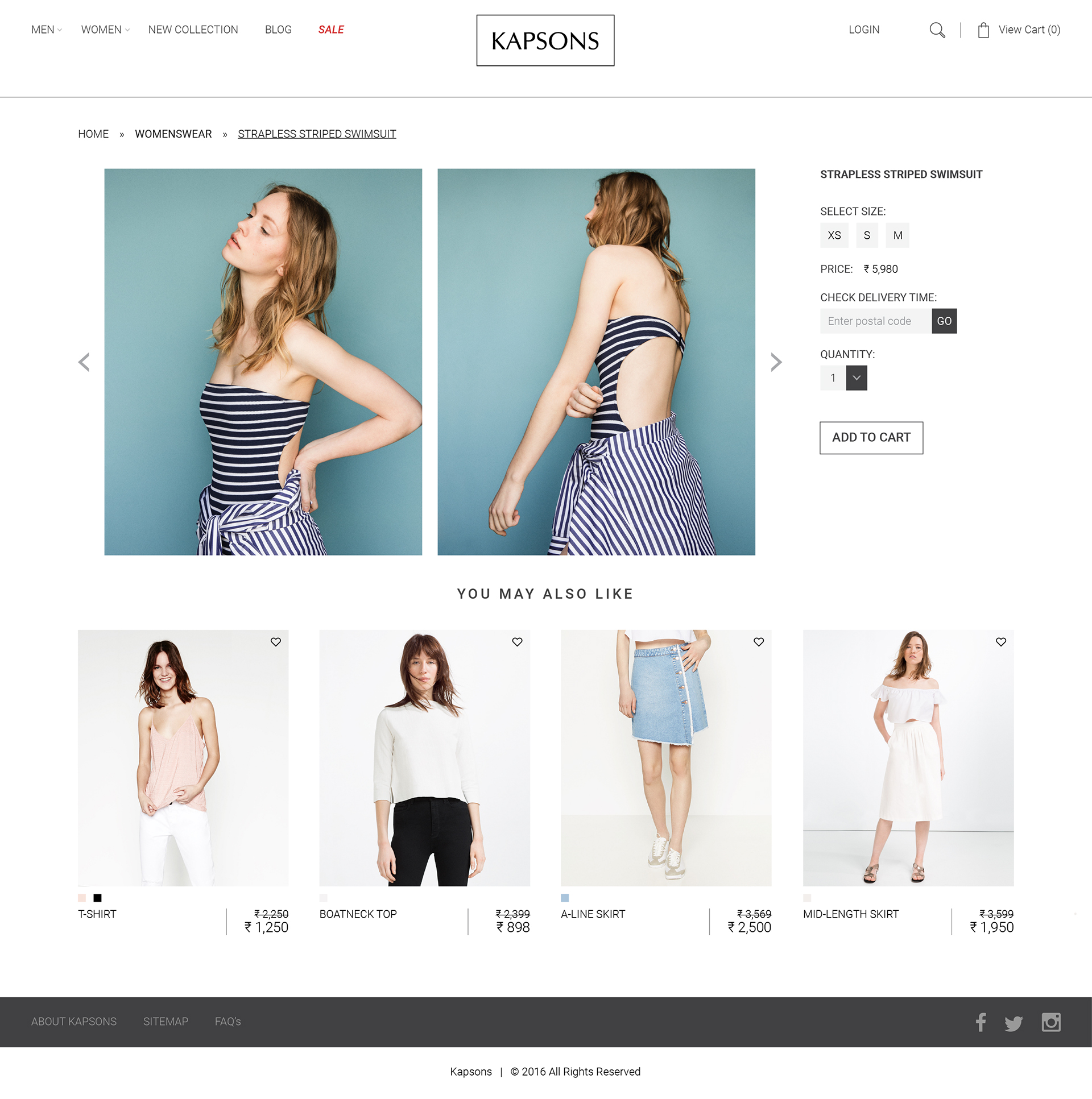
Final Solution:
After the testing and iterations of prototypes, we came to a final solution:
- We need filters like brands, sizes, colours, price, fit and categories.
- We need good photographs of model to attract customer.
- We need special offers to attract more customers.
- We need to show trending products and latest styles to keep our customers updated.